Designing for Success: How to Create Effective Marketing Materials with Typesetting and Layout
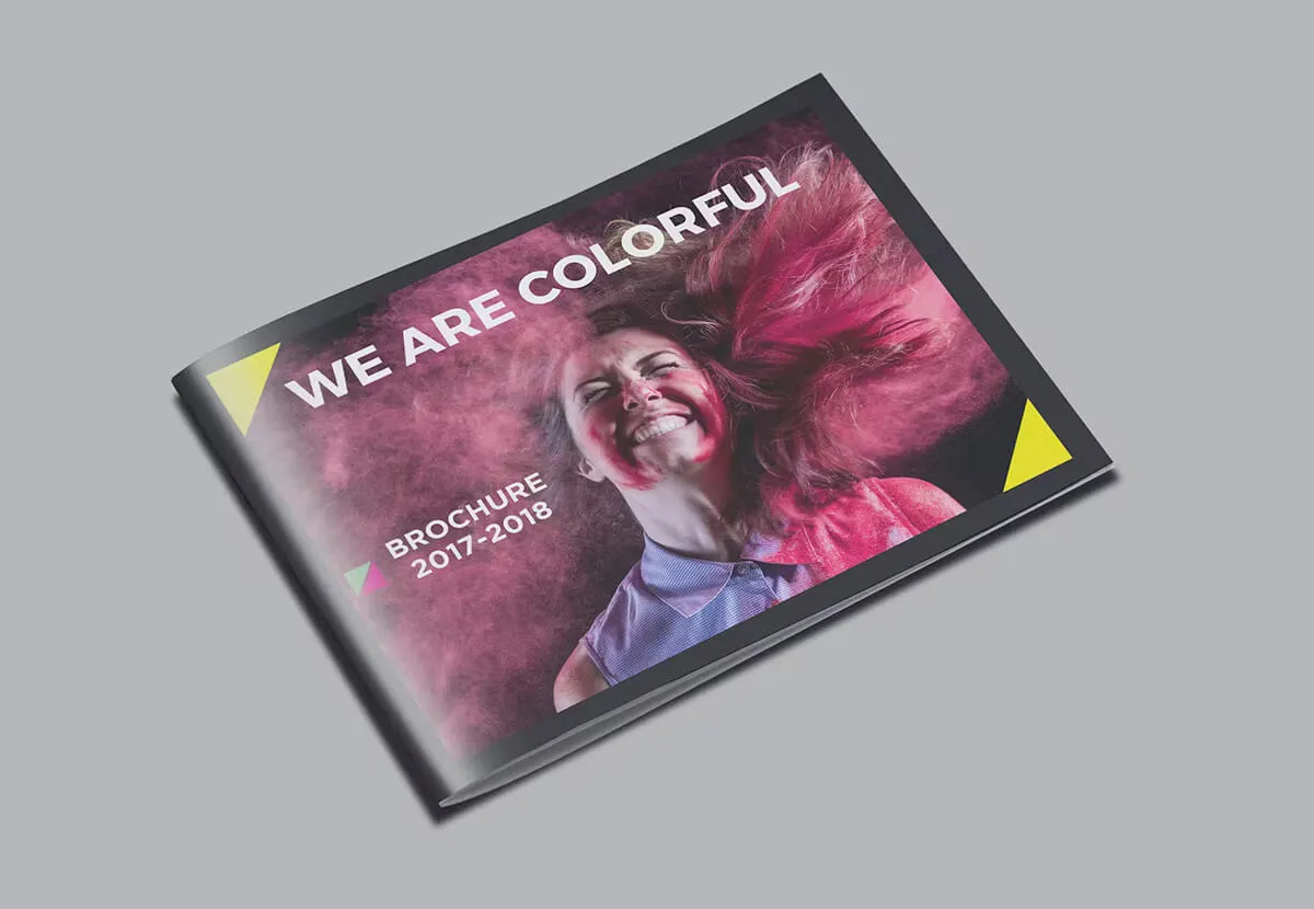
Designing for Success: How to Create Effective Marketing Materials with Typesetting and Layout
Effective Marketing Design: Typesetting and Layout information from Print Ready
Design plays a crucial role in capturing your audience’s attention and leaving a lasting impression. This is why designing effective marketing materials should never be taken for granted. When it comes to design, typesetting and layout are two critical elements that can make or break the success of your marketing efforts.
Typesetting refers to the process of arranging text on a page or document in a way that is visually appealing and easy to read. It involves choosing the right fonts, spacing, alignment, and other design elements to create a cohesive look that supports the overall message being conveyed.
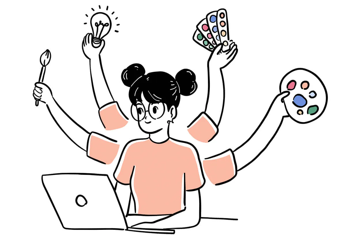
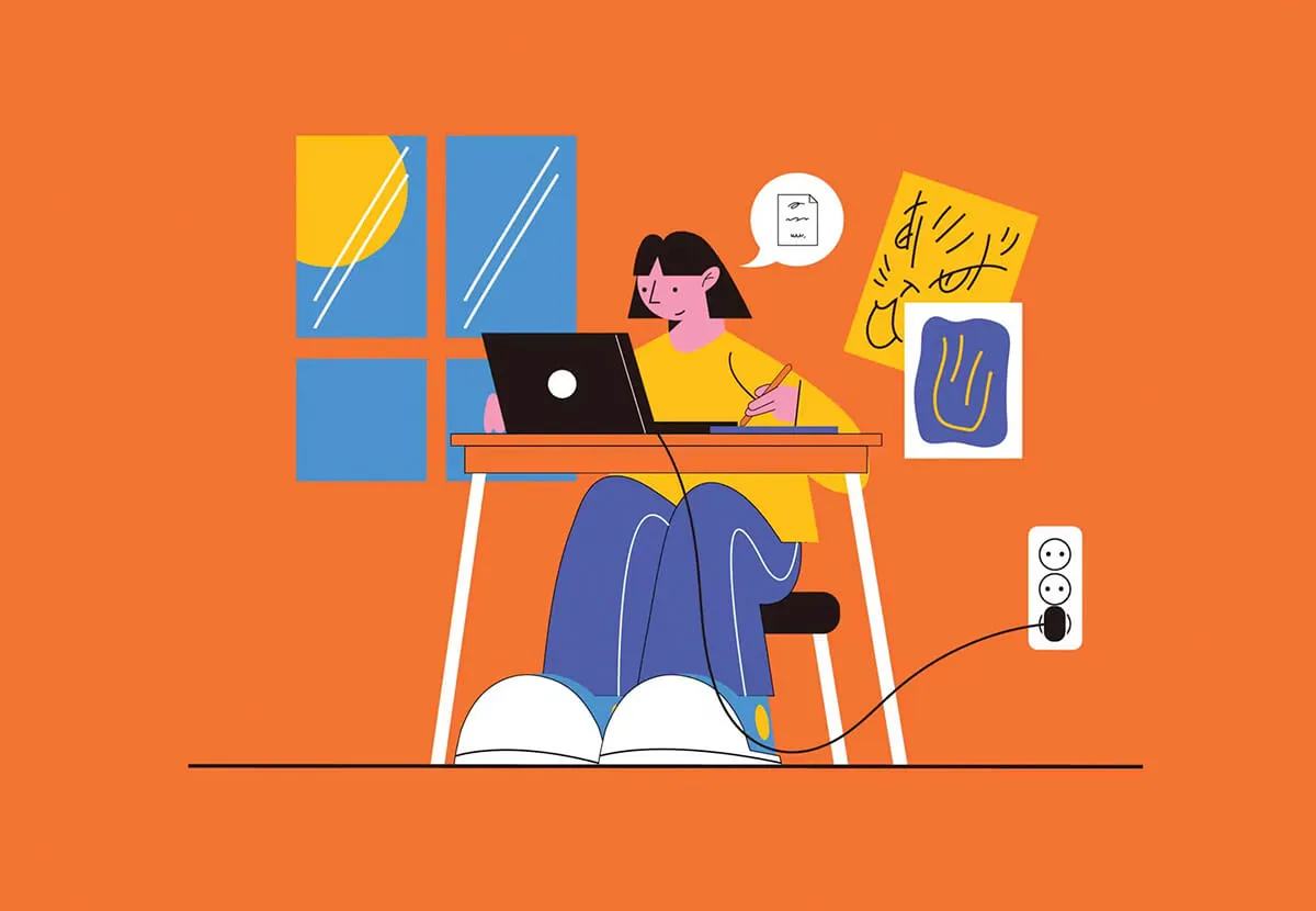
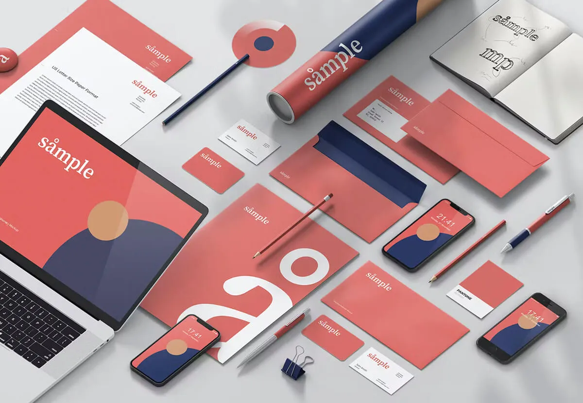
Examples of Typesetting by Print Ready Dublin
 |  |  |
Effective typesetting is crucial in marketing materials because it can directly impact the success of a campaign. Poorly designed materials with hard-to-read text can be off-putting and cause potential customers to lose interest in your brand.
Well-designed marketing materials, on the other hand, grab attention, convey information clearly, and enhance your brand’s image. Proper typography establishes credibility by making content appear professional and organised.
Choosing font styles that match your brand personality is key. For example, eco-friendly brands often benefit from natural, organic-style typefaces, while corporate brands may opt for clean, structured fonts.
Elements Within Typesetting
When it comes to typesetting, there are several key elements designers must consider.
- Font choice: Fonts should reflect your brand’s personality and tone.
- Spacing: Proper letter, word, and line spacing improves readability.
- Alignment: Consistent alignment creates structure and visual harmony.
- Contrast: Complementary fonts add interest without distraction.
Intentional spacing guides readers through content while maintaining a clean, polished look.
Tips for Effective Typesetting
Choosing a font that aligns with your brand is essential. Fonts communicate emotion and personality. Luxury brands may suit elegant serif fonts, while tech companies often benefit from modern sans-serif styles.
Spacing is equally important. Correct kerning, tracking, and leading significantly improve legibility and design quality.
As a general rule: increase spacing slightly for small fonts and reduce it for larger fonts to maintain balance.
The Importance of Layout
Layout refers to how visual elements—text, images, and white space—are arranged on a page. A strong layout guides viewers through content and influences how a brand is perceived.
Effective layout relies on composition, hierarchy, and balance to create visual interest and clarity.
- Composition: How elements are arranged on the page.
- Hierarchy: Visual order of importance.
- Balance: Distribution of visual weight.
- Grid systems: Ensure consistency across designs.
Examples of Typesetting and Layout from Print Ready
Composition, Hierarchy & Balance
Composition determines how design elements interact. Hierarchy controls how information is consumed, while balance ensures visual harmony.
Headlines and calls-to-action typically appear first, with supporting content positioned lower. Alignment reinforces structure and consistency throughout the design.
Avoid overcrowding. White space gives elements room to breathe and helps guide the viewer’s eye naturally.
How Typesetting and Layout Work Together
Typesetting and layout work in harmony to deliver clear, visually appealing messages. When aligned correctly, they improve readability, guide attention, and reinforce brand identity.
A balanced combination prevents clutter, confusion, and disengagement while maintaining consistency across marketing materials such as brochures, signage, and social media graphics.
Tips on Balancing Typesetting and Layout
- Use hierarchy to guide the viewer’s eye.
- Limit font choices to one or two complementary styles.
- Maintain consistent spacing and alignment.
- Embrace white space to reduce visual clutter.
Creating Effective Marketing Materials
Different marketing materials require different design approaches. Brochures benefit from clear hierarchy, flyers need bold focal points, and social media graphics must be legible on smaller screens.
Understanding how typesetting and layout adapt across mediums ensures consistent, effective communication.
Tips for Creating a Unique Brand
Establish your brand personality first, then select typography and layouts that reinforce it. Custom typography, consistent grids, and cohesive spacing help build a recognisable visual identity.
Typesetting and layout play a vital role in creating impactful marketing materials. If you’re looking for professional design services, we’d love to help.
Contact us today to learn how we can elevate your marketing materials and branded stationery.
Email design@printready.live or call (01) 858 1000 to discuss your ideas.