Print Ready’s Comprehensive Guide to Effective Business Poster Design

At Print Ready, we’ve honed our expertise in poster design over years of working with diverse businesses. We’ve learned that whilst trends may come and go, certain principles remain crucial for creating posters that truly captivate.
Here’s our in-depth guide to crafting posters that not only look brilliant but also deliver results.
Define a Clear Objective
Every impactful poster begins with a clear objective. When we start a new project, our first step is always to identify the poster’s primary goal. Is it to promote a sale, announce an event, or raise awareness about an issue? This purpose becomes the guiding star for all subsequent design decisions.
Understanding the target audience is equally vital. Different demographics respond to design elements in different ways. A poster aimed at young professionals will often use a different visual language than one targeting families or retirees. By aligning the design with the audience’s expectations, we ensure the message resonates effectively.
Viewing context also plays a key role. A poster designed for close-up viewing in a shop window will differ significantly from one intended to be seen from a moving vehicle. These considerations influence everything from font size to colour choices.
Create a Strong Visual Hierarchy
Visual hierarchy is essential in poster design. It guides the viewer’s eye through the content in a deliberate and logical sequence. We use size, colour, contrast, and placement to establish this hierarchy.
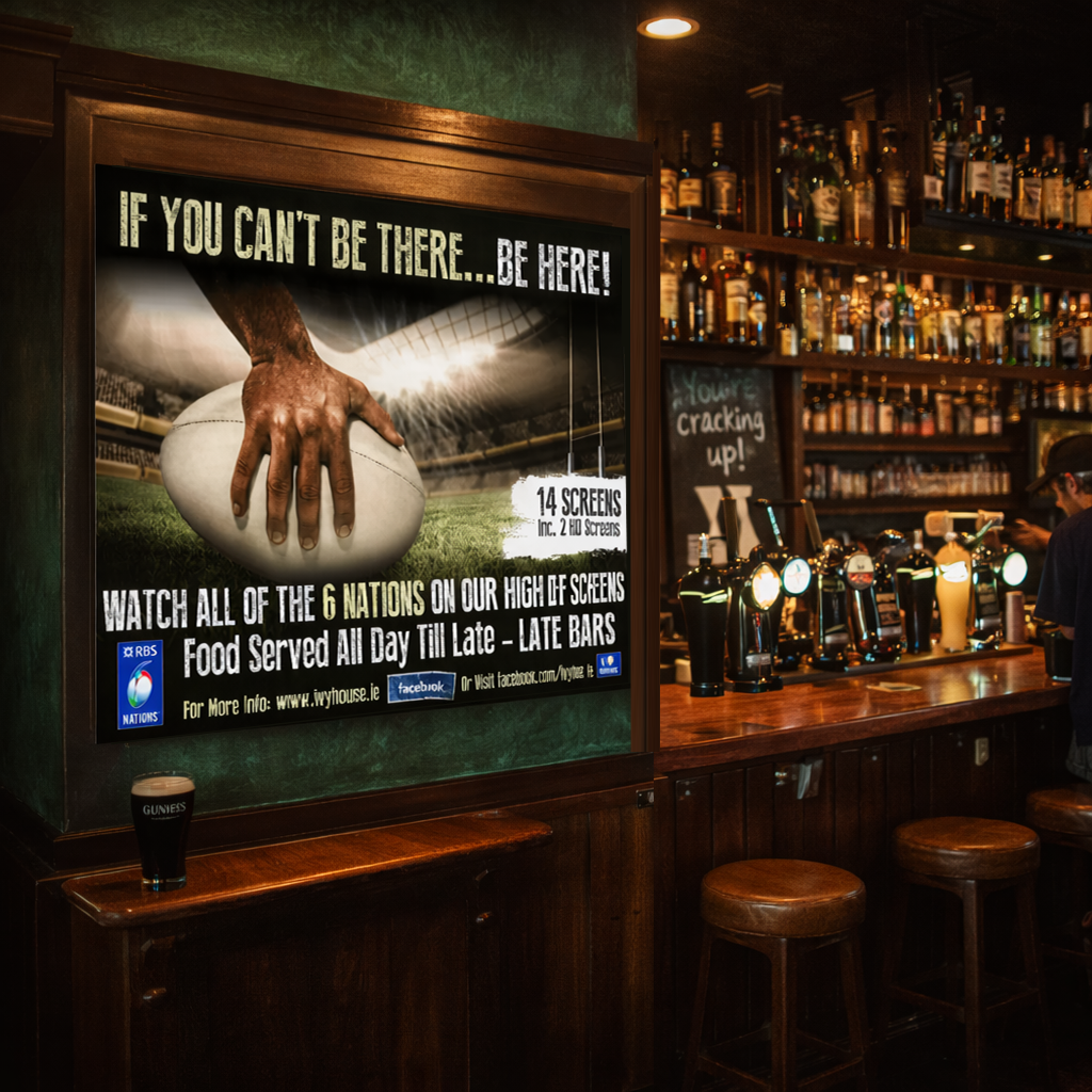 | 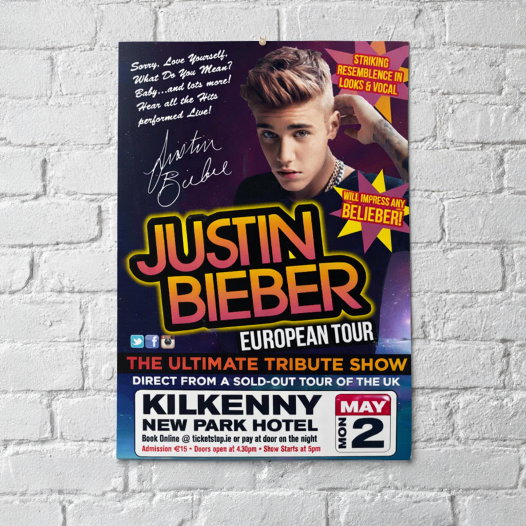 | 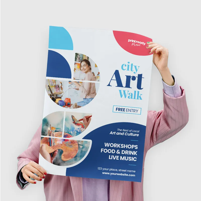 |
The most important information should be immediately noticeable, even from a distance. This may be a bold headline, a striking image, or a key detail such as an event date or price. Supporting information should remain clear and readable at the intended viewing distance.
We often apply the “squint test”. If you squint at the poster, the key elements should still stand out. This ensures the core message is understood at a glance.
Use High-Quality Visuals
The quality of images and graphics can make or break a poster. High-resolution imagery and professionally designed graphics are essential. Blurry or pixelated visuals can undermine the credibility of the message.
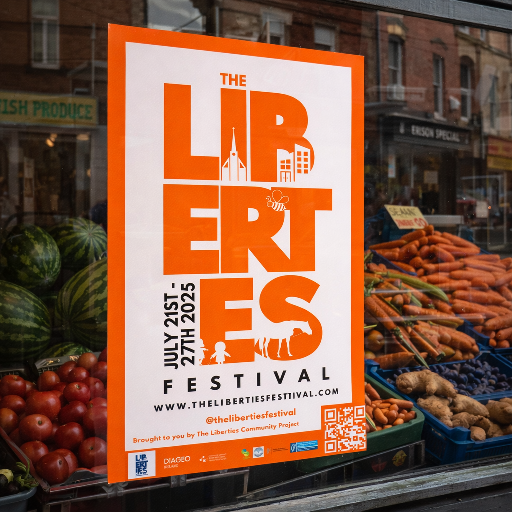 | 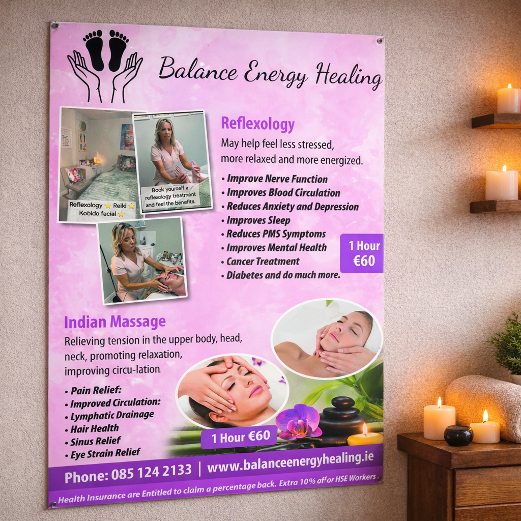 |  |
Every visual element should support the purpose of the poster. Carefully chosen images can evoke emotion, reinforce the message, and sometimes communicate more effectively than large amounts of text.
We also consider the balance between text and imagery. Strong visuals attract attention, while well-written copy delivers the detail and drives action.
Choose Colours Strategically
Colour is a powerful communication tool. Different colours evoke different emotions and associations. For example, blue often conveys trust and professionalism, while red can suggest urgency or excitement.
Brand consistency is always a priority. We ensure the colour palette aligns with the client’s wider brand identity, helping to reinforce recognition across marketing materials.
Contrast between text and background is critical for readability. We also factor in how colours reproduce in print, selecting hues that will remain vibrant and accurate on the finished poster.
Select Appropriate Typography
Typography affects both readability and tone. We typically recommend using no more than two or three fonts to maintain a clean, cohesive design.
Font choice should reflect the brand and the purpose of the poster. A playful font may suit a family event, while a clean, modern typeface is often better for corporate or professional messaging.
Font size, spacing, and hierarchy are carefully considered to ensure text remains legible at the intended viewing distance. Headlines, subheadings, body copy, and calls to action should be clearly distinguished.
Utilise White Space Effectively
White space, or negative space, is a vital but often underestimated design element. It helps balance the layout, improves readability, and allows key information to stand out.
Less cluttered posters are usually more effective. White space gives the eye room to rest and makes the content easier to absorb.
While it can be tempting to include too much information, a more spacious layout often delivers a stronger and clearer message.
Ensure Print-Ready Designs
Moving from screen to print requires careful attention to technical detail. We check colour modes, typically CMYK, ensure a resolution of 300 DPI, and confirm correct bleed and safe zones.
Paper choice also affects the final result. Gloss finishes can enhance colour vibrancy but may reflect light, while matte finishes are often easier to read in bright environments.
For large-format posters, we review how the design scales. Elements that work on screen may need adjustment when printed at full size, so proofs are checked carefully before final production.
If you have a question or need advice about print and design, call into our shop on Glasnevin Avenue, email hello@printready.live or call (01) 858 1000. We will be delighted to help.